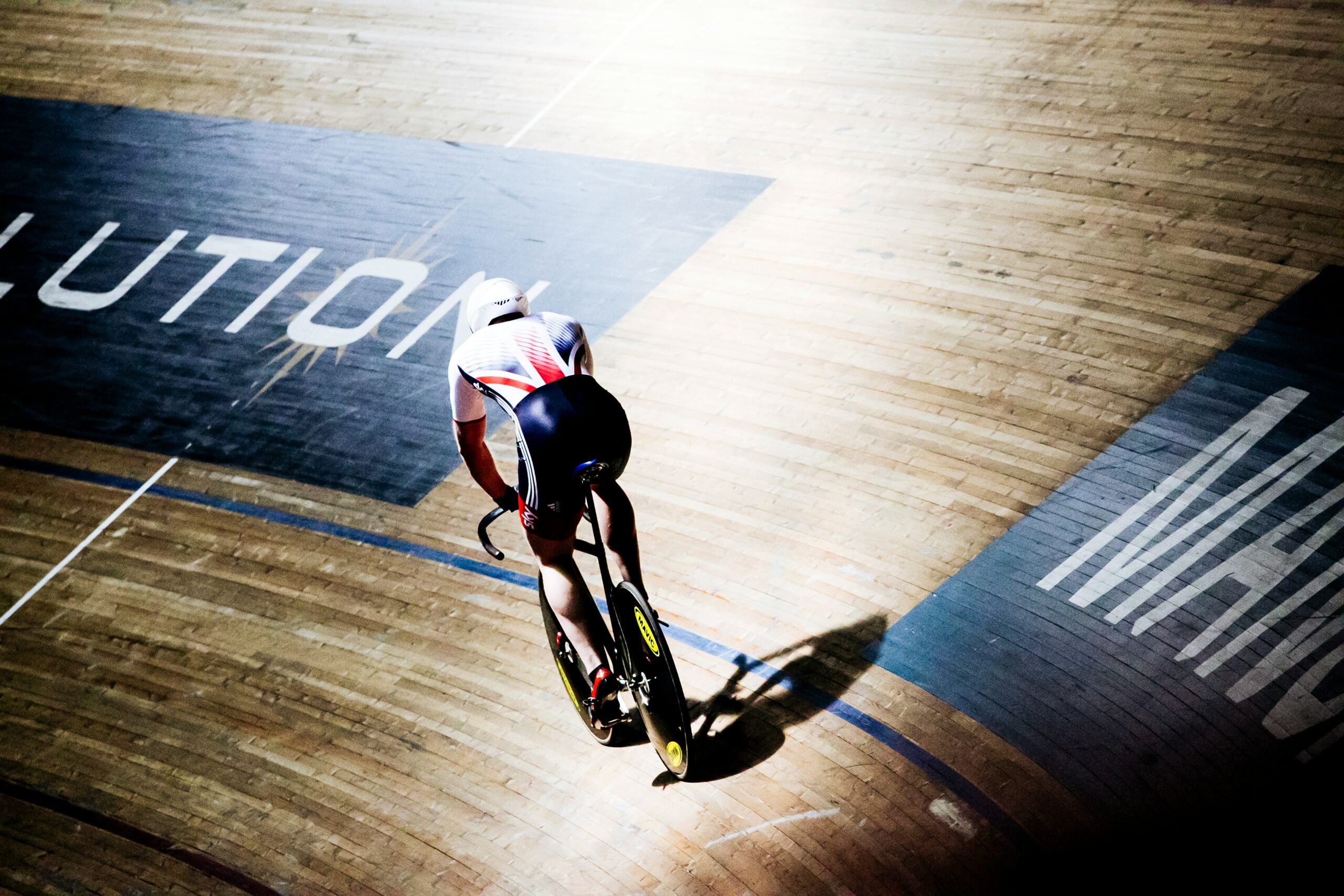

We don’t know about you but everyone here at Jambi HQ has kind of caught Olympic fever. Deeply invested in a sport you’ve never watched before? Yes! A growing but completely misplaced sense that maybe you should take up a new hobby? Guilty. Really enjoying all the Olympic memes? Maybe too much. We were all in and it’s in that spirit that we’ve dragged ourselves away from the rolling BBC coverage to bring you this blog post.
Inspired by Team GB’s cycling ethos, today we’re squeezing into our lycra suits, clipping in our cleats and taking to the velodrome of web design to secure some marginal gains that will have a big impact on your next site’s results.
These five design efficiency tips will make for a more cohesive design, increase usability, offer your site more longevity, speed up the build phase and reduce ongoing maintenance effort and cost. All at a difficulty rating of zero for you as the designer. Let’s dive in:
Set up global styles
No, we’re not talking jazzy Olympic kits (though for the record, Nigeria was our favourite) here we mean a consistent suite of typographical elements (e.g. H1, H2, blockquotes etc.) and spacing rules (e.g. if H1 is 36px, the spacing underneath is also 36px) that are going to appear across the site. By fixing these parameters your site will feel cohesive and it’ll really speed up the build phase.
Don’t overlook ‘boring blocks’
Your site will no doubt include some really innovative use of animations and layout, but it’s exhausting to look at a site that is ALL action – it’d be like watching the 100m final on a loop for two weeks. A mix of building blocks is essential and we advocate for including ‘boring blocks’ – that is, five or six simple layouts that hold basic content e.g. multiple paragraphs of text, a two-column text/image layout, an image gallery etc.
Even if you don’t need them immediately, having these in your back pocket will mean that as and when the site expands and the content changes, the ‘new’ content won’t feel tacked on because it was built in the same style as the original site, giving your work longevity and reducing ongoing costs.
Utilise ‘partial blocks’
We like to think of these as the triathlon of web design – they’re a cluster of elements that are always used together in multiple blocks and they provide a slightly more flexible level of consistency throughout the site. Imagine you’re Alex Yee, skillfully blending a left-aligned heading and right-aligned copy with a button link to provide one gold-medal-winning web feature.
Standardise graphic elements
The Olympic rings are an iconic brandmark but your site will no doubt feature multiple graphics in terms of logos, icons, arrows and buttons. By creating overarching rules (e.g. the positive action button always uses the primary brand colour, and the secondary action has a different style) rather than making decisions on a page-by-page basis, the whole site will feel unified and be much easier to navigate for future users.
Assign some smart colour palette rules
As a designer, you’ll already know the importance of a banging colour palette (shout out to Belgium) but you may not have considered the importance of imposing colour rules. For example, a hover rule: when hovering over a button the colour (whichever colour that is) can be set to 90% opacity. It’s little details like this that, used consistently, will give your design a really finessed feel.
Individually, each of these little tweaks will improve your site but, much like the Olympics itself, it really is a team effort. When combined, they offer you maximum efficiency without limiting any of your creativity.
Why not talk to our very own champion, Rob, about how he can help ensure that your next site is an absolute win?